D.R. Horton
Brief
D.R. Horton approached me to create a commemorative pin design for the upcoming Indy 500 that would feel more visually engaging and collectible than previous years’ designs. The project aimed to combine regional Indiana identity, motorsports culture, and company branding into a single cohesive design system while maintaining strong readability and visual hierarchy within a compact pin format.
Solution
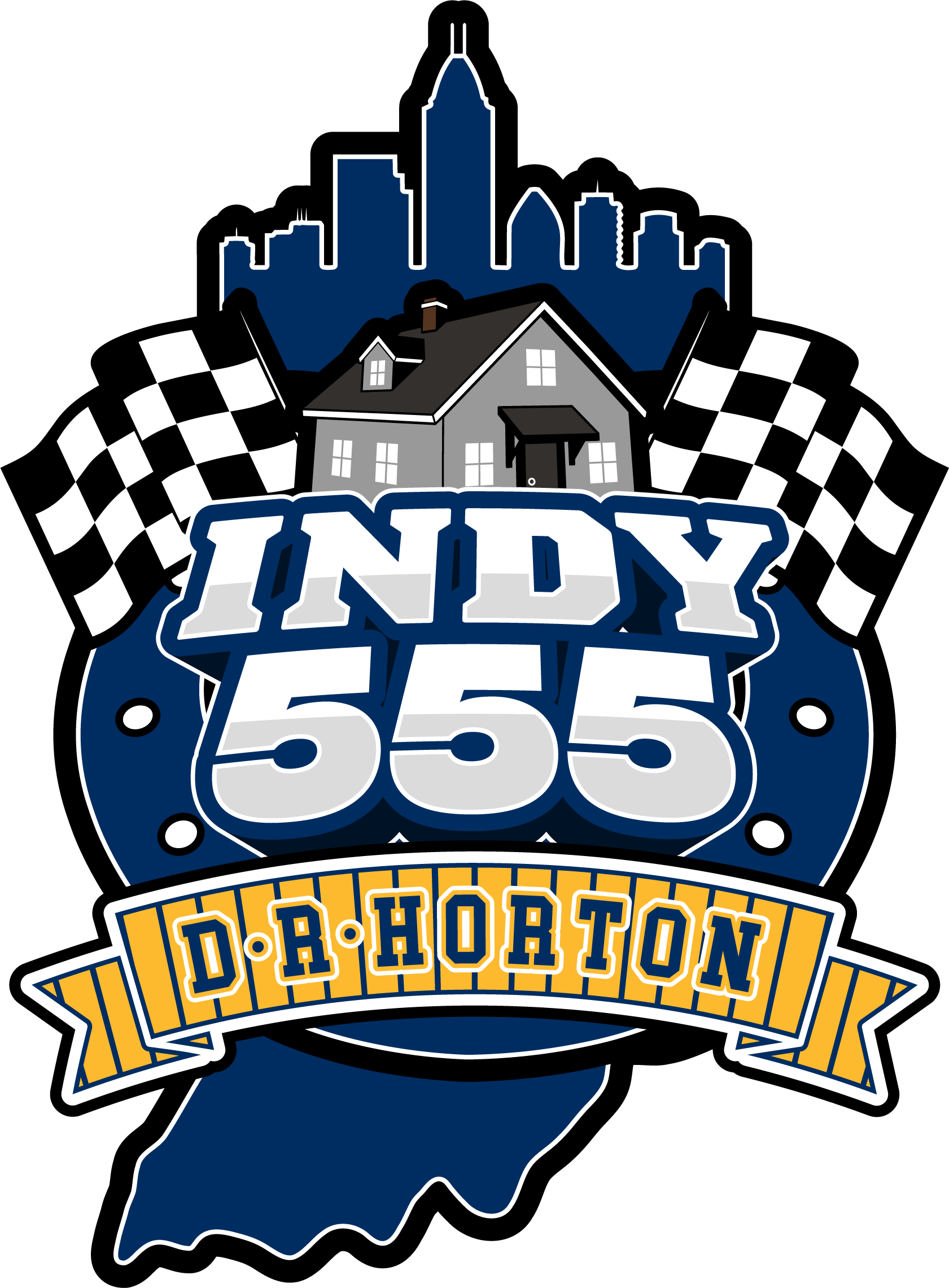
The final design used the silhouette of the state of Indiana as the foundational shape for the composition, allowing multiple visual elements to be layered together while maintaining a strong regional identity. The Indianapolis skyline was positioned along the top edge of the state outline to naturally reinforce the Indiana setting, while racing flags, a custom home illustration, and the Colts horseshoe icon were incorporated to connect motorsports culture with D.R. Horton’s identity as a homebuilding company.
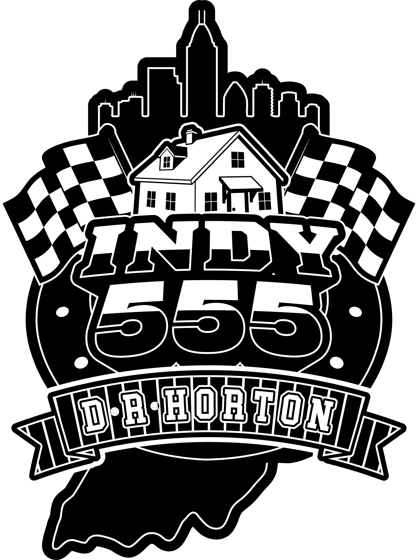
To create a bold focal point, “INDY 555” was designed using dimensional typography layered over the center of the composition, helping anchor the visual hierarchy and improve readability at smaller physical sizes. The final color palette leaned heavily into Indiana sports culture through the use of Pacers-inspired blue and gold tones, including subtle striped detailing within the banner ribbon inspired by classic Pacers jersey designs. A secondary black-and-white version was also developed to ensure manufacturing flexibility across different production methods.
Service
Merchandise Design
Feedback
"[FEEDBACK]" -Jake Hicks
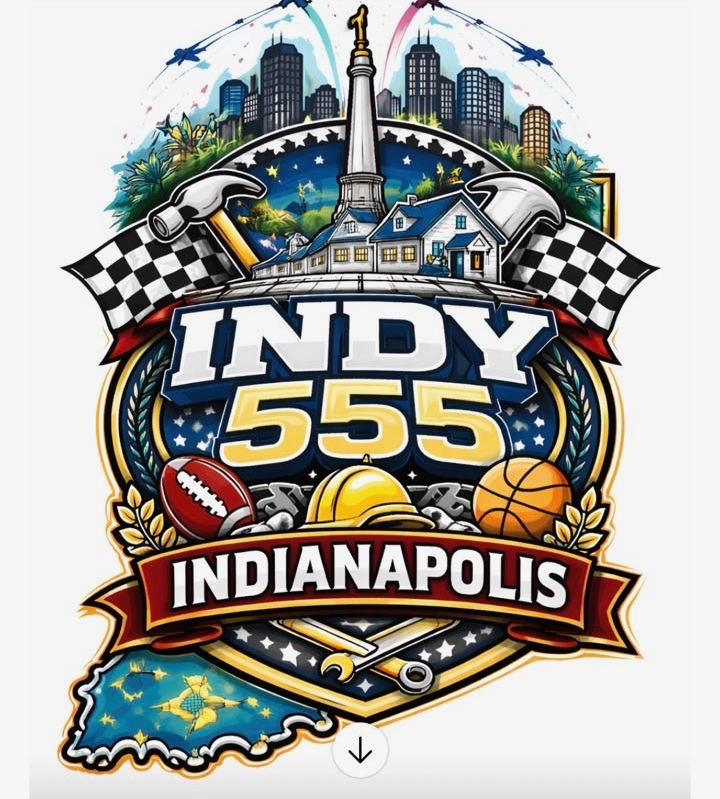
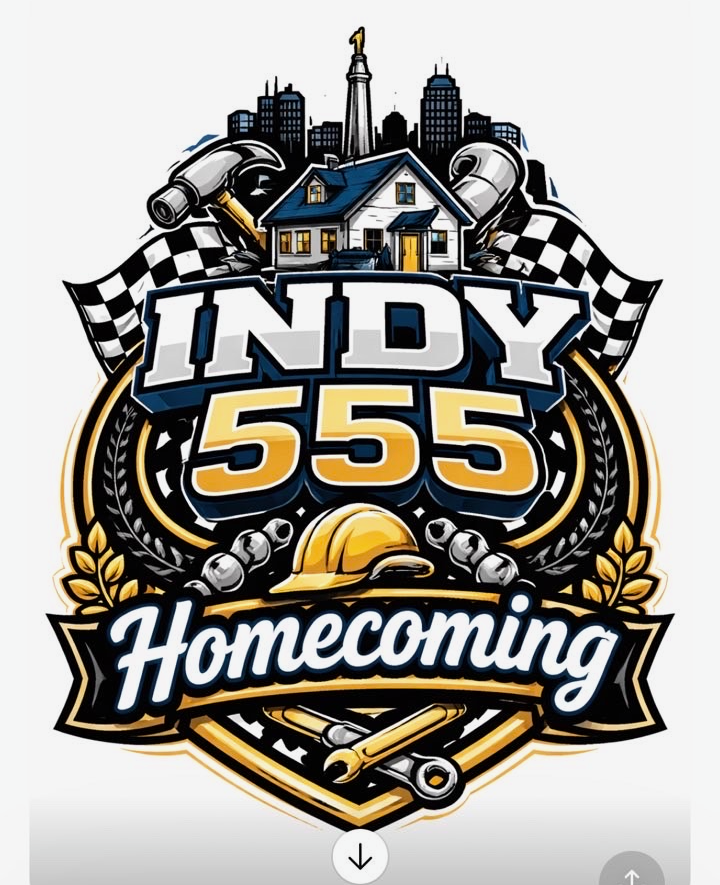
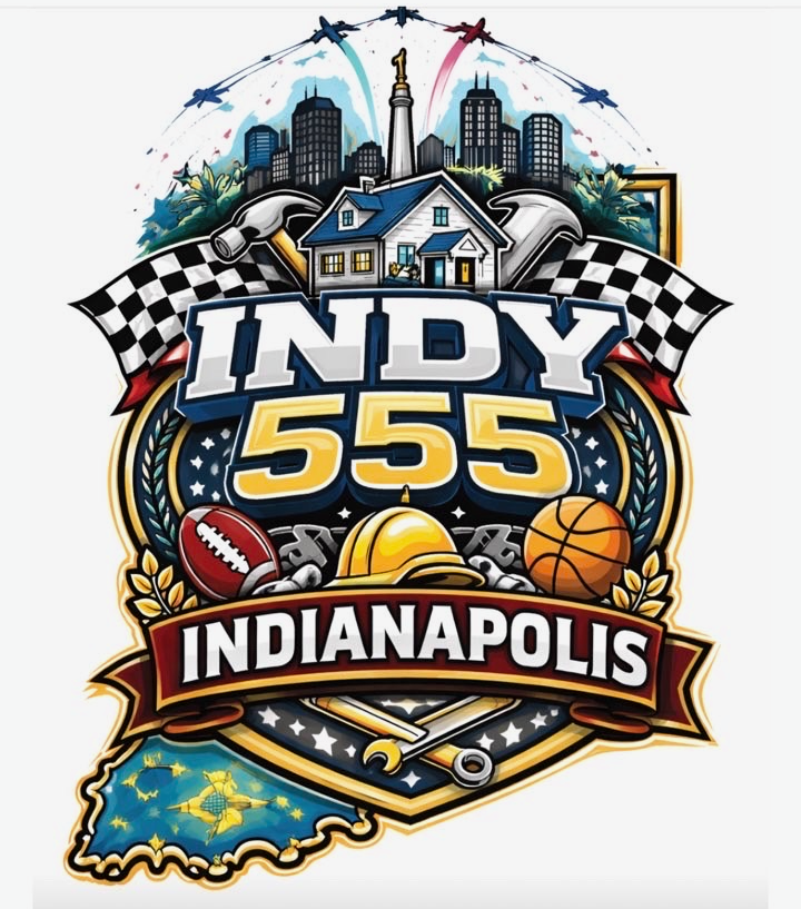
[AI References provided by client]