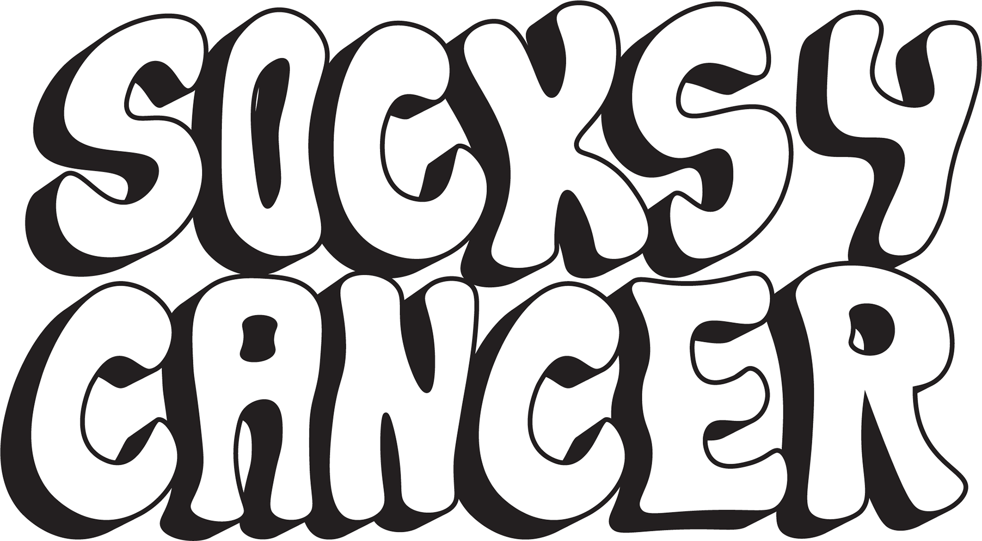
Crazy Socks vs Cancer
Brief
Recently, I had the heartfelt opportunity to collaborate with two individuals very close to my heart— a close friend and his father. Their request was simple yet profoundly meaningful: to create a logo for their brand, 'Crazy Socks vs Cancer'. Given the personal significance of this project, my immediate response was an emphatic "Hell YES!"
The goal of 'Crazy Socks vs Cancer' was clear and deeply impactful. They aimed to sell cancer-themed socks, channeling the proceeds towards funding cancer research. This mission resonated with me on a personal level, as my own mother has been courageously battling breast cancer, currently facing her second diagnosis. Their cause struck a chord, and my response was a resounding, "Say no more."
Solution
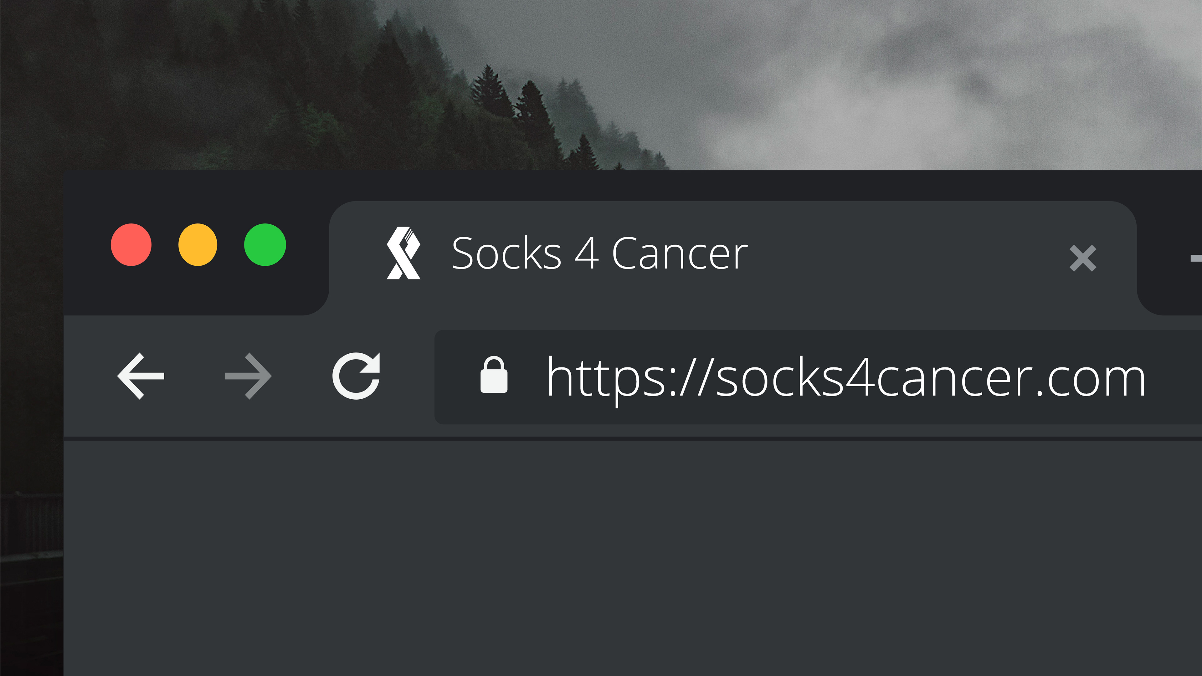
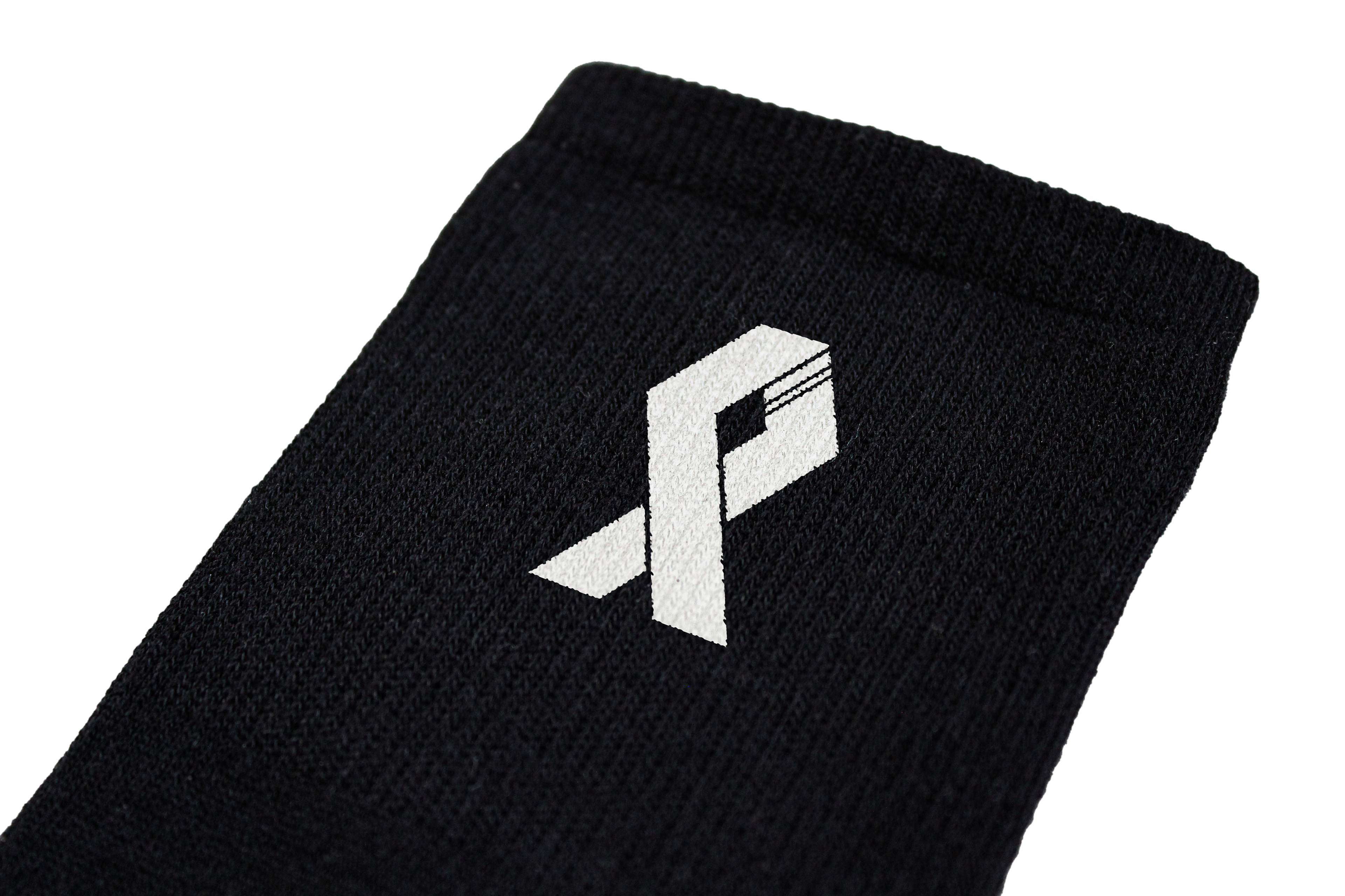
In the spirit of their mission, I presented not one, but two logos that spoke eloquently to their cause. A sleek black-and-white version was crafted for their classic line, while a vibrant tie-dye adaptation featured an alternate logo. Witnessing the joy on their faces as their vision took shape was truly priceless. However, the commitment didn't stop there. Every detail was meticulously chosen to reflect both their mission and my emotional investment. From handpicked colors conveying quality and my personal experiences to typography carrying their essence, each element aimed to amplify their message and purpose.
Service
Logo Design
Color Palette and Typography Selection
Mockups
Feedback
[Placeholder]